Modern web layouts require flexibility, responsiveness, and simplicity, all of which can be achieved efficiently with Flexbox. When combined with Tailwind CSS, building such layouts becomes faster and more intuitive. Let us delve into understanding how to use flex in Tailwind CSS and justify flex items.
1. Flexbox Fundamentals with Tailwind CSS
Flexbox (Flexible Box Layout) is a modern CSS layout model designed to arrange elements efficiently within a container, even when their size is unknown or dynamic. It simplifies complex layouts by providing a flexible way to align, distribute, and reorder items. Unlike older layout techniques such as floats or inline-block, Flexbox gives you precise control over both the direction and alignment of elements, making it ideal for building responsive user interfaces.
- One-dimensional layout system (row or column)
- Handles dynamic sizing (grow, shrink, basis)
- Controls spacing, alignment, and distribution
- Supports vertical and horizontal centering easily
- Responsive by design without complex media queries
Flexbox works with two main components:
- Flex Container: The parent element that enables flex behavior using
display: flex - Flex Items: The child elements inside the container that follow flex rules
Once a container is defined as flex, its children automatically become flexible items that can be aligned and distributed using various properties.
1.1 Simplifying Flexbox with Tailwind CSS
Tailwind CSS follows a utility-first approach, meaning you apply small, single-purpose classes directly in your HTML instead of writing custom CSS. This makes working with Flexbox significantly faster and more consistent. Each Tailwind class maps directly to a Flexbox property. For example:
flex→display: flex;flex-col→flex-direction: column;justify-center→justify-content: center;items-center→align-items: center;
This eliminates the need to remember complex CSS syntax and reduces context switching between HTML and CSS files. Another major advantage is responsiveness. Tailwind allows you to apply Flexbox utilities conditionally using breakpoints: <div class="flex flex-col md:flex-row">. In this example, on small screens the items are stacked vertically, while on medium and larger screens the items are arranged horizontally.
1.2 Getting Started with Flex in Tailwind
To start using Flexbox in Tailwind, you simply add the flex class to a container element.
<div class="flex">
  <div>Item 1</div>
  <div>Item 2</div>
  <div>Item 3</div>
</div>
By default, the flex direction is set to row (horizontal), items are aligned at the start, and each item takes only the space it needs. You can further control the layout using additional utility classes such as flex-row or flex-col to set the direction, flex-wrap to allow items to wrap onto the next line, and gap-4 to add consistent spacing between items.
In summary, Tailwind CSS removes the complexity of Flexbox by giving you intuitive, reusable classes that make layout building faster, cleaner, and highly maintainable.
2. Practical Flexbox Implementation
Now that we have understood the core concepts of Flexbox and how Tailwind CSS simplifies its usage, let us look at a practical implementation. The following example demonstrates different Flexbox utilities in action to help you build responsive layouts efficiently.
<!DOCTYPE html>
<html lang="en">
   <head>
      <meta charset="UTF-8" />
      <meta name="viewport" content="width=device-width, initial-scale=1.0" />
      <title>Tailwind Flexbox Examples</title>
      <script src="/https://cdn.tailwindcss.com"></script>
   </head>
   <body class="p-6 bg-gray-100">
      <div class="flex flex-col gap-6">
         <!-- Flex Direction Example -->
         <div class="flex flex-row gap-2 bg-gray-200 p-4">
            <div class="bg-blue-500 text-white p-4">Row 1</div>
            <div class="bg-blue-500 text-white p-4">Row 2</div>
         </div>

         <div class="flex flex-col gap-2 bg-gray-200 p-4">
            <div class="bg-green-500 text-white p-4">Column 1</div>
            <div class="bg-green-500 text-white p-4">Column 2</div>
         </div>

         <!-- Justify & Align Example -->
         <div class="flex justify-between items-center bg-gray-300 p-4 h-24">
            <div class="bg-red-500 text-white p-4">Left</div>
            <div class="bg-red-500 text-white p-4">Right</div>
         </div>

         <!-- Flex Sizing Example -->
         <div class="flex gap-2 bg-gray-200 p-4">
            <div class="basis-1/4 grow bg-purple-500 text-white p-4">Grow</div>
            <div class="basis-1/4 shrink bg-purple-700 text-white p-4">
               Shrink
            </div>
            <div class="basis-1/2 bg-purple-900 text-white p-4">Fixed</div>
         </div>

         <!-- Wrap Example -->

         <div class="flex flex-wrap gap-2 bg-gray-200 p-4">
            <div class="bg-indigo-500 text-white p-4 w-32">Item 1</div>
            <div class="bg-indigo-500 text-white p-4 w-32">Item 2</div>
            <div class="bg-indigo-500 text-white p-4 w-32">Item 3</div>
            <div class="bg-indigo-500 text-white p-4 w-32">Item 4</div>
            <div class="bg-indigo-500 text-white p-4 w-32">Item 5</div>
            <div class="bg-indigo-500 text-white p-4 w-32">Item 6</div>
            <div class="bg-indigo-500 text-white p-4 w-32">Item 7</div>
            <div class="bg-indigo-500 text-white p-4 w-32">Item 8</div>
            <div class="bg-indigo-500 text-white p-4 w-32">Item 9</div>
            <div class="bg-indigo-500 text-white p-4 w-32">Item 10</div>
         </div>

         <!-- Centering Example -->
         <div class="flex justify-center items-center bg-gray-300 p-4 h-24">
            <div class="bg-yellow-500 text-black p-4">Centered</div>
         </div>
      </div>
   </body>
</html>
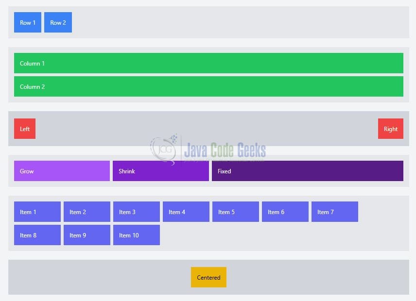
2.1 Code Explanation
This example demonstrates how to use Tailwind CSS Flexbox utilities to create different layouts: the parent container uses flex flex-col gap-6 to stack sections vertically with spacing, the first section shows horizontal (flex-row) and vertical (flex-col) directions, the next demonstrates alignment using justify-between (space between items) and items-center (vertical centering), the sizing example uses basis, grow, and shrink to control how items resize within the container, the wrap example uses flex-wrap to move items onto the next line when space is limited, and finally the centering example combines justify-center and items-center to perfectly center content both horizontally and vertically.
2.2 Code Output
The above code renders a structured layout showcasing multiple Flexbox behaviors in action. You will first notice two sections demonstrating layout direction, where items are displayed horizontally in a row and vertically in a column, helping visualize how flex-row and flex-col impact flow. The next section highlights spacing and alignment, where elements are pushed to opposite ends using justify-between while remaining vertically centered with items-center. In the sizing example, items dynamically adjust their width based on basis, grow, and shrink, clearly showing how space is distributed among flexible elements. The wrap example demonstrates how Flexbox handles overflow by allowing items to move onto the next line when horizontal space is insufficient. This behavior is controlled using flex-wrap, ensuring that items do not shrink excessively or break the layout—instead they wrap cleanly into multiple rows, maintaining readability and structure across screen sizes. Finally, the centering example visually confirms how content can be perfectly aligned both horizontally and vertically using a combination of Flexbox utilities.
3. Conclusion
Flexbox is a powerful layout system, and Tailwind CSS makes it significantly easier to use through utility classes. By combining direction control, alignment utilities, and sizing options like basis, grow, and shrink, developers can build highly responsive and flexible layouts with minimal effort.
